Image 1: Tom ford Neroli Portofino Ad Campaign
Year of Creation: 2011
Creative Director: Tom Ford
Source: http://blog.myfdb.com/2011/04/naked-models-singing-pour-some-portofino-on-me/
Content:
This is an ad campaign for a highly illustrious perfume brand ‘Tom Ford’. The two models appear to be naked, positioned in a provocative pose in the middle of the frame. They appear to be playing with a slightly larger than life ‘Tom ford’ perfume bottle, splashing the fragrance on one and other. This is one of 3 photos for the ad campaign, none of which are relative to one and other.
Semiotic Analysis:
This add sets its self away from you’re average add campaign through a use of cleverly hidden signs and symbols imbedded in the image. The models representing the perfume appear to be what’s called an ‘icon’. They’re a direct representation of whom we would associate would wear the exclusive perfume.
Perfume ads are usually comprised with either a man (to signify an aftershave) or a woman (to signify a fragrance). The man and the woman are used together in tis image as ‘signifiers’ for the ‘signified’ fragrance. The assumption that the audience makes when they’re used in direct relation to one and other is that the intended product is unisex. Which is what the art directors were trying to achieve in this photo.
The models are framed at eye level, creating that relationship between the ad and the viewer. They’re pouring the perfume onto one and other, relating the back to the product projecting the idea that you could be ‘that’ person. This is what’s called ‘conative’ semiotics. Using elements such as; a closed frame (the eye contact), the signifiers (the models) and the signified (the perfume) their creating the intention wearing this perfume will make you ‘sexy’.
This image is using advertisings bread and butter of the concept ‘sex sells’. It’s using a narrative representation as a means to create a storyline between the viewer and the image. The models are displayed in a provocative position with a close distance to the camera imitating a real world experience. There’s also a sense of playfulness giving that sense of interactivness between the perfume and the models.
The product is placed as the focal point of the photo, drawing the viewer back to that point to communicate the intention of the ad. The image has a high modality as it is appears to be a glorified depiction of ‘sex’.
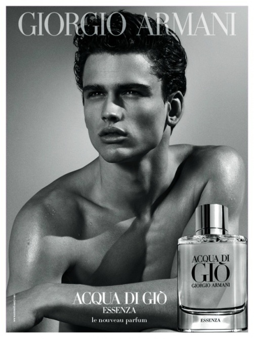
Image 2: Giorgio Armani Acqua Di Gio Ad Campaign
Year of creation: 2011
Creative Director: Fabien Baron
Source: http://models.com/people/fabien-baron/11/client/advertising
Content:
This ad campaign is for another renowned brand in the perfume market, Giorgio Armani. The add features a portrait shot of a man from his torso upwards. The top of the photo features a transparent logo ‘Giorgio Armani’ and as you follow the image to the bottom, the perfume name ‘Acqua di Gio’ is centred in the bottom middle, with the product sitting adjacent.
Semiotic Analysis:
The man is pictured as the signifier, an icon for the perfume (the signified). This is a common theme in a lot of perfume ads. He is displayed to the audience as a man that represents everything the brand has to offer. This gives reason as to why the brand name ‘Giorgio Armani’ is placed on top of the mans head.
This image makes a point of difference from the last ad campaign in the sense that it’s a conceptual image; it doesn’t tell a story, making it a symbolic representation. The man is shot from a low angle, giving him power in relation to the viewer. This is imitated with the perfume bottle pictured on the bottom right. It indicates to the audience that it is something that you want, that you have to reach for. This is quite typical for a Mens perfume add. By creating a low camera angle you’re telling the viewer he has power over you. His eye direction also eludes to the fact that he’s ‘looking off into the distance’, creating that sense of detachment from him, making him something to idolise.
The frame has been created to be read in a ‘Z’ like format, following the cultural norm to read left to right. This is established (as mentioned above) by identifying the model with the brand name, then the fragrance which is pictured down the bottom right. This identification is established further by the high modality of the image, creating a idealisation of the Giorgio Armani man.
Comparison of Images:
These advertisements although similar in many ways, have executed their campaigns in different ways to portray distinct meaning to their products. Both images use an ‘Icon’ to represent their product through a ‘high modality image’ however its how they both portray these ‘Icons’ that is different. In the ‘Tom Ford’ Campaign you’re looking onto the models at eye level, creating a relationship between the viewer and the product. In the ‘Giorgio Armani’ campaign you’re looking up at the man, creating that detachment, limiting our real world experience. The way in which the two images are framed are slight in contrast. The ‘Giorgio Armani’ campaign follows a ‘Z’ like structure, where as the ‘Tom ford’ campaign incorporates it’s compositional elements like it’s ‘text’ and ‘product’ with in the image itself.
